RANFONE PERFORMANCE | BRAND IDENTITY + APPAREL + PHOTOSHOOT
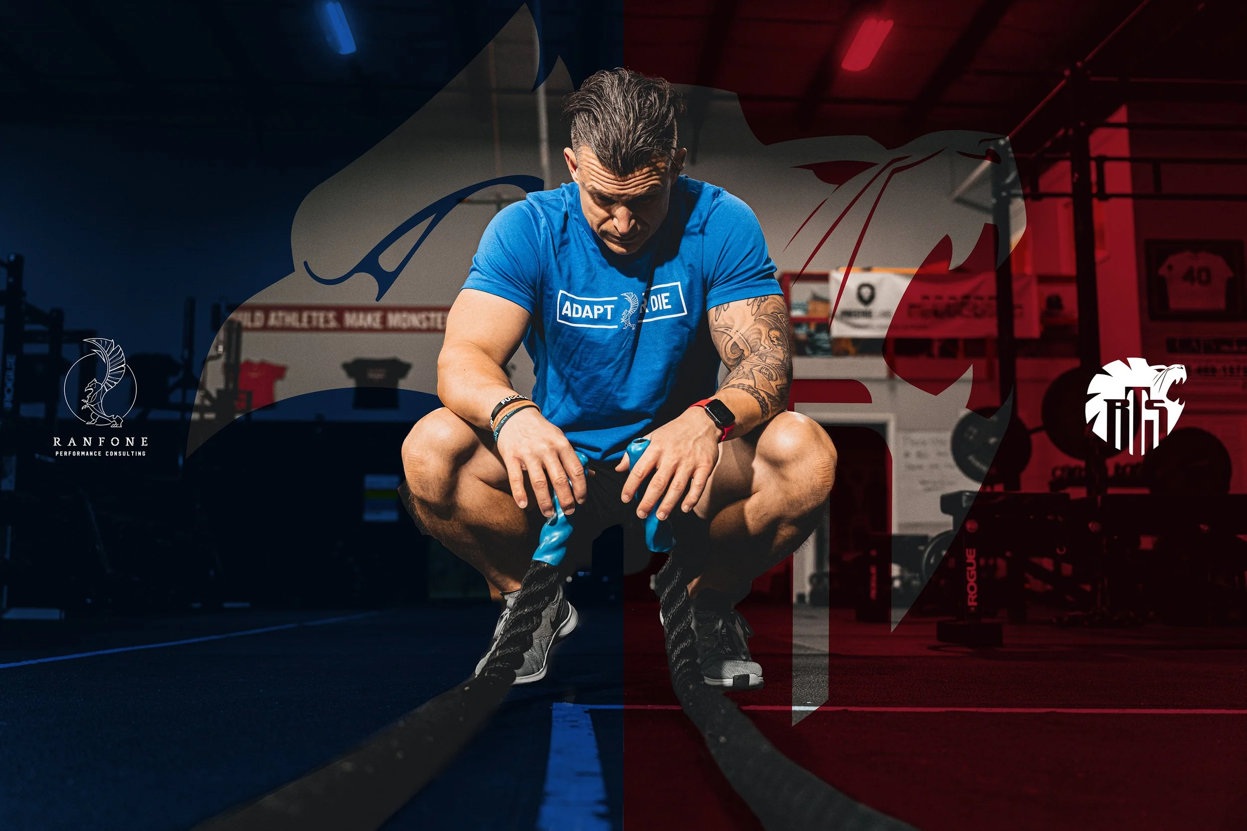
A tale of two coaches…After 10 years of success, it was time to evolve. Throughout his career as an athlete or coach, Michael Ranfone has achieved peak levels of performance for himself and like-minded athletes. In 2010, he expanded the opportunity to share his proven scientific-based theories by opening up Ranfone Training Systems (RTS). In 2019, amid a pandemic, Michael wanted to offer an elevated platform experience tailored to coaches and dedicated athletes.
Industry
Project Scope
Health and Wellness
Branding
Custom Typography
Merchandising
Uniforms
Photoshoot
Similar to an RTS athlete, the Ranfone mark needed to be versatile for reproduction on multiple pieces ranging from apparel to marketing collateral. It needed to capture the fury, energy, and drive Michael pours into his athletes, his coaches, and himself. It also needed to be raw and act as a badge to be worn by RTS athletes.
After an initial brand decode, I focused on the intersection between RTS and Ranfone Performance. The goal was to celebrate the differences between the two brands while defining the benefit of the new extension. Both were set on a foundation of raw, no bullshit, and we make monsters; however, Ranfone Performance was an elevated experience focused on coaches and dedicated athletes.
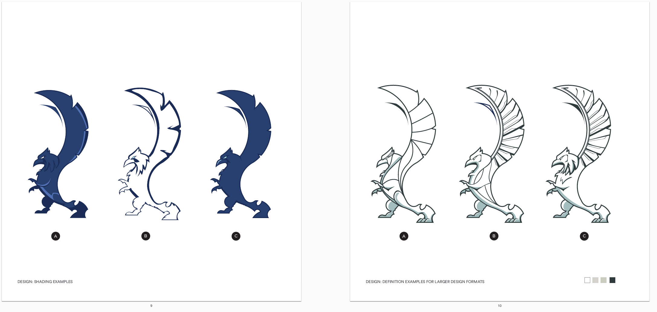
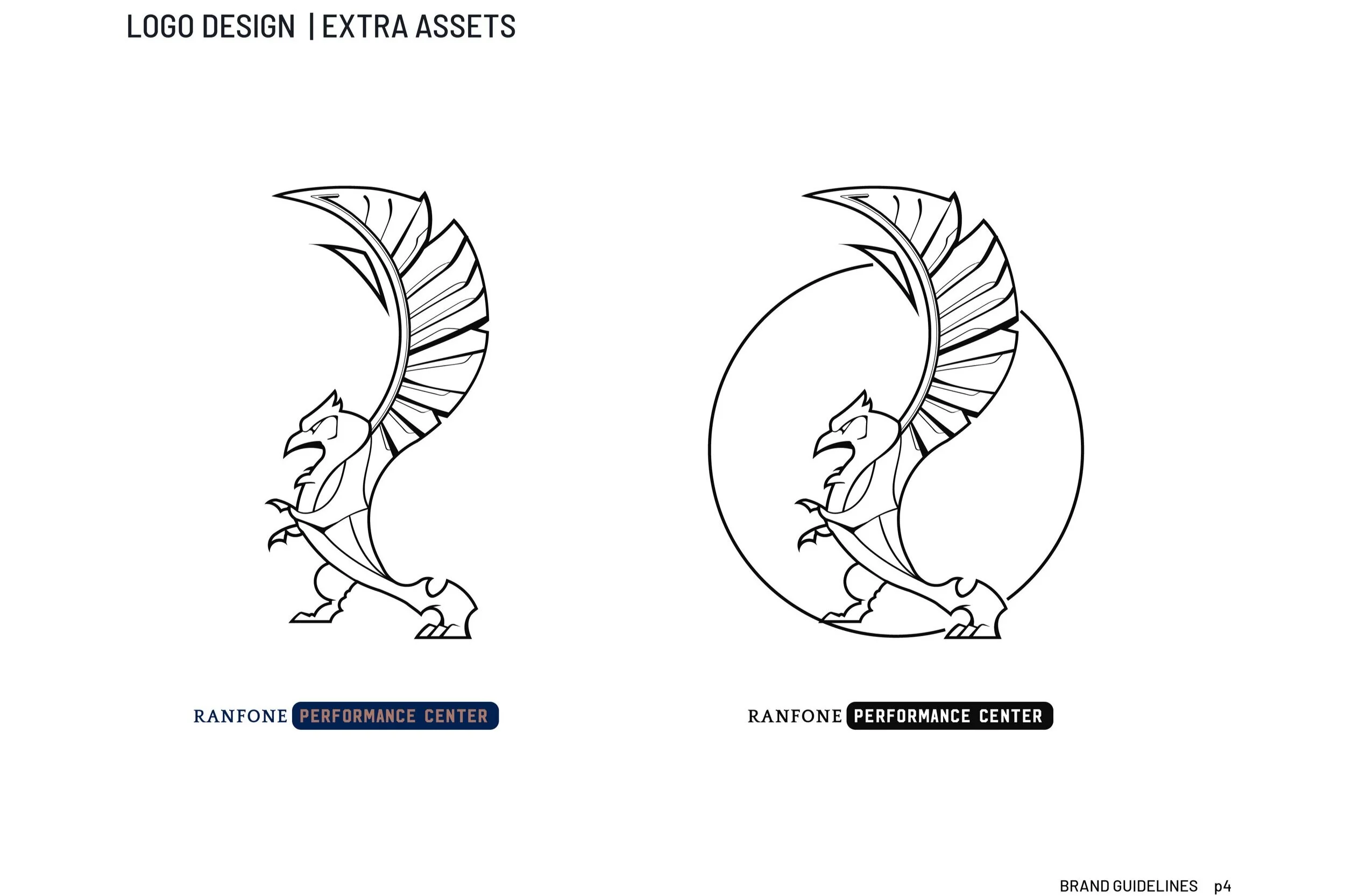
The decode led us to a Griffin that echoed a Capital “R.” Unlike the RTS logo, which had a woodcut design that captured the rawness of the brand, Ranfone performance required a more polished execution. What if…it was carved of stone vs. wood? What would it look like if it was created during the Renaissance?
CONTOUR/DETAIL EXPLORATORY
BRAND GUIDELINES BOOK
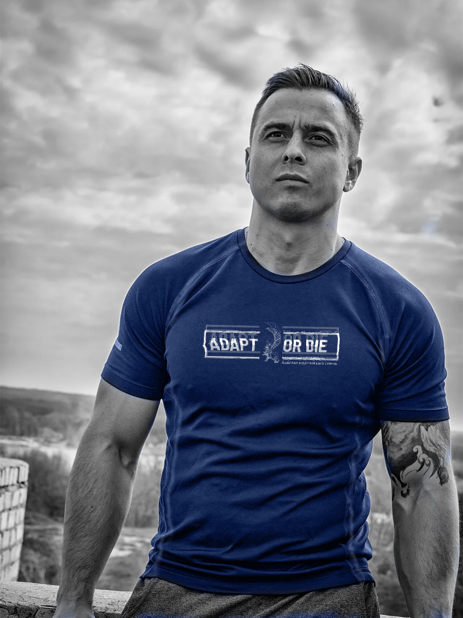
APPAREL DESIGN
TYPOGRAPHY: CUSTOMIZED STENCIL NOTCH
ORIGINAL FONT
PHOTOSHOOT
“…COVID threw a giant GFY into our plans. Not once did we give up or feel sorry for ourselves, but put our efforts into continuing to service our clients and ADAPT to the new circumstances.”


